
Design an app that helps your sunscreen routine,
Sunnie
Scroll ↓
A digital personal assistant for a better sunscreen routine.
CHALLENGE
An estimated one in five Americans will develop some type of skin cancer in their lifetime, according to the American Academy of Dermatology (AAD). However, many people either underestimate the risks of the sun or find sunscreen a hassle to apply and don’t prioritize applying sunscreen.
SOLUTION
Sunnie app helps people find the right sunscreen and apply it regularly.
MY ROLE
UX/UI designer from research to final mockups
Design Process
My design process followed the design thinking cadence with the Human-Centered Design approach throughout the whole process.

1. Empathize
To develop a holistic understanding of the problem, I conducted secondary research. I’ve found a lot of different resources about sunscreen usage in the U.S. from published research studies to a personal blog sharing the difficulties of applying sunscreen. I noticed a lot of interesting facts and behavioral patterns about sunscreen application and begin to highlight some of the most interesting findings.
The most fascinating finding for me was people’s sunscreen usage. After taking a deep dive into all the data points, I wanted to learn the reason behind the sunscreen avoidance and failures by talking to real people.
Here were some of the specific questions I wanted to ask:
How do people apply their sunscreen currently? Do they know a proper way or importance/urgency of applying sunscreen?
What is people’s general perception of sunscreen?
What are the challenges that prevent people from incorporating sunscreen into their routines?
Does sunscreen routine change base on the demographics and/or level of outdoor activity?
Before jumping right into the interview process, I conducted a screener survey to recruit people who struggle to form a consistent sunscreen habit. For the primary research, I recruited 10 people via social media, 3 men and 7 women. 2 out of 7 women were moms. Each interview session lasted 30 minutes.
2. Define
With 10 sessions of 1:1 interviews, I had TONS of material to work with. This was, without a doubt, the divergent thinking stage, And now it was time for convergent thinking.
Affinity Map
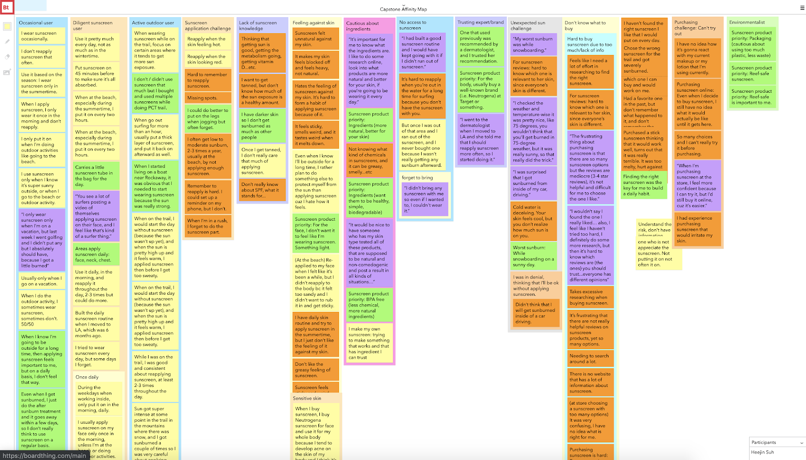
I quickly put the highlights together using *digital* sticky note.
I created an affinity map and started to look for patterns. There are a handful of crucial insights from this affinity map. One of the most important patterns I saw from this affinity map was that people avoid sunscreen because they hate how sunscreen feels, which I didn’t think was a big problem before talking to people. Look at this quote from one interviewee:
“Sunscreen feels sticky and weird. It makes me not want to put it on at all. I'd rather get sunburned!”
-Some people *REALLY HATE* sunscreen
Persona
Based on the patterns I discovered, I’ve identified three personas.

Diligent Kristen
Kristen follows all the hot beauty trends and tries to be really good about her skincare routine, but it’s not a habit quite yet. She sometimes forgets to apply from time to time. Like this morning, she totally forgot about applying sunscreen because she was in a hurry. “I was going to wear it but then I keep forgetting! I should probably apply later in the day too… but I’m not sure I’ll remember to do it. I wish there was something that reminds me to apply based on my schedule.”
Feeling Lost Brad
Brad gets sunburned fairly frequently because he always forgets to apply or bring sunscreen with him. He forgot to bring it again while going golfing today. He goes to the store and tries to buy one but gets overwhelmed by all the options they have, and ends up making a random purchase. Finally, he applies it, and it is that sticky type he hates. “I really don’t like feeling sticky. I won’t wear it, and maybe I’ll be fine because my skin got enough tan this summer,” he thinks. Soon enough, he gets another sunburn.
Super Mom Carla
Carla is a super mom who works full time but also cares for the family a lot. She wants the best for her family and especially for her daughter, Alyce, but it is hard as a new mom. Everything is so new and it feels like she has so much to learn. There is just too much information out there…it’s so overwhelming! “I have no idea what baby sunscreen is the best! I wish there was a platform where I could learn from other moms’ trial and error so that I don’t go through the same thing,” she wishes.
How Might We…?
Identifying personas was a huge help when it came to defining the problems I needed to solve.
How might we help users to identify the sunscreen that they potentially like?
How might we help users remember to apply sunscreen?
How might we teach users the proper knowledge of sunscreen in a more engaging way?
How might we create a community for new moms to share their experience with kids sunscreen?
How might we make the overwhelming product reviews more relevant and digestible for the users?
3. Ideate
Based on personas and HMW questions, I identified 5 user epics and came up with multiple user stories. Here are a few highlights:
Epic: Sunscreen application behavior
As a user, I want to get a reminder notification to apply sunscreen every day so that I can develop a consistent sunscreen routine.
Epic: Finding the right product
As a user, I want to figure out the exact type of sunscreen that works on my skin so that I don’t feel gross when applying it.
As a user, I want to quickly filter out the sunscreens that are not organic or gentle for kids, so that I can save time and energy picking the right product for my child.
These user stories were a great guideline when I started ideating possible solutions, and they helped me stay focused on user needs’ opposed to my assumptions.
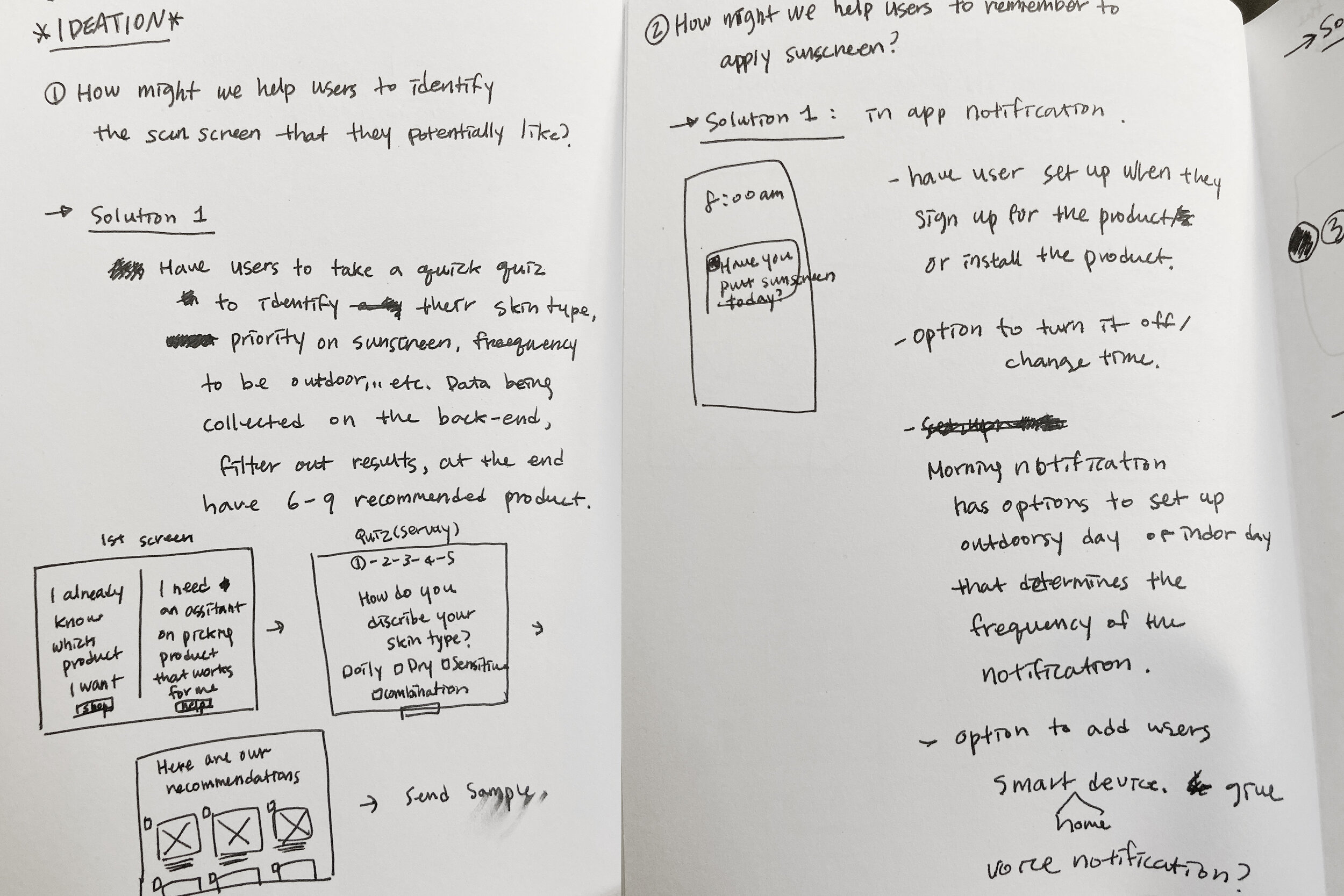
Highlights from early ideation
4. Prototype
User Flow
After ideation, I quickly identified a couple of potential MVP features (red routes) which solve overlapping user problems from three personas. I’ve created user flows for the MVP features:

Sketching & guerrilla usability testing
Based on these user flows, I quickly sketched out key screens on paper to conduct a quick and dirty guerrilla usability testing. I got initial feedback from the real users before I jumped onto the computer.

Sketches for guerrilla usability testing
Wire Flow
I conducted 5 usability testing with the lo-fi prototype from above. Based on feedback from the 5 users (they were not included in the next round of usability testing to prevent bias), I iterated on my initial sketch and turned it into wireframes and laid out the wire flows.
Sunnie App Wire flow (Click to enlarge)
Visual Design
It was finally time to start thinking about the visual design of the app. I wanted to keep the overall look and feel of the app positive, bright (hence the name “sunnie”), inviting, and fun. I made several design decisions based on that:
Brighter colors with a couple of accent colors to pop
Unique/funky fonts that bring an element of “fun”
Harsh shadow treatments that give a nod to “sunscreen”
Simple illustrations to bring just enough fun branding elements to the screen
And with the style guide, Sunnie 1.0 was created. Here are some of the key solutions of Sunnie:


Wireframe, visual design, and prototype were all built with Figma.
5. Testing
Once I completed the visual design and a clickable prototype, it was time to go into the wild and see if Sunnie was actually going to be helpful.
I did 2 rounds of usability testing with 10 people in total. I got mostly positive feedback throughout the usability testing.
One interesting finding was the male user’s feedback and female user’s feedback were somewhat different on the tone of the copy and appearance of the app.

During the first round of usability testing, two semi-major usability problems were found, and most of the comments were to add more features for them to do more things with the app.

I went back into Figma to update the UI based on people’s feedback and conducted the second round of usability testing. In the second round, there were no usability problems. I heard more positive feedback and suggestions for advanced features in the next iteration.
Reflection and next steps
I started with a simple problem to solve for people like myself and learned about different problems that people were experiencing more broadly. Finding solutions through user-based insights is always a really fascinating experience for me. All of my design decisions were based on actual user needs, and that led to all users finding the Sunnie app useful and engaging. Everyone was very invested and excited about it; they kept asking if I’m going to release this app for real!
If that’s the case, for the next round of iteration:
- Add detailed explanation on the Sunnie sunscreen challenge and add more features regarding tracking their progress, milestones, and rewards.
- Work on the user flow to track package delivery.
- Work on the community aspect of the product (Supermom Carla’s need)
- Seek investment opportunities? (jk but maybe…🤔)
Until I get funding and become Jeff Bezos in the sunscreen industry, on to the next project!👏🏼