
Design better coupon managing system
Byte Technology
Scroll ↓
Better Discount setup experience for the B2B product.
Byte Technology allows various food companies, such as food manufacturers, vending companies, and food service companies, to sell food through kiosks. Customers can purchase food at a Byte store at a special discount based on the scenarios set up by Byte’s clients and these discounts are critical to their business.
The Opportunity
The current discount administration UI/UX on the Byte dashboard has several deficiencies that make creating and managing discounts difficult and very limiting.
My Role
I was on this project as a UX/UI designer to improve the discounts experience in Byte’s dashboard so it’s easier to navigate, create, and manage discounts. Throughout the project, I worked closely with a product manager and a developer from Byte Technology to get a better understanding of their business model and existing dashboard and align with the improved product goals.
I was responsible for:
Analysis of the current experience
User flow
Sketching
Wireframe
High fidelity prototype

Design Process
1. Understand the product and use cases
2. Dig into the current experience
3. Re-imagine the user flow
4.Create a better discount experience

1. Understand the use cases
Due to our tight timeline of 4 weeks and the complexity of their system, Byte provided a lot of user insights and use cases upfront. When they say “discount”, many of the use cases are rather complex and unique to the Byte platform. Based on what they shared, I made a chart to determine what functions need to be considered in the new discount experience.
2. Dig into the current experience

Current Byte Discount Dashboard
As a part of the discovery phase, I went on the Byte dashboard to see the limitations of the current product:
The discount feature is hidden from the main landing page. It’s currently under the “premium” panel, which is not intuitive.
Inconsistency in dashboard data table headers.
4 different flows that accomplish similar things and are confusing.
Extremely limited data entry inputs for the ‘create new discount’ form compared to the complexity of the discount use cases.
Field labels on forms are often missing or not clearly stating what entries are desired.
No validation before the form is submitted, leading to user errors.
No search functionality, resulting in difficulties in data access and data sort for the user.
Ineffective data entry methods with an excessively long list of radio buttons without a search function.
In addition to improving the current discount experience, the Byte team requested new features:
An aggregated view of all discounts and coupons on one new dashboard.
The visual indicator of “currently live” discounts.
Billing export in case the client wants to bill to the location (“Location” is where the kiosk is located, which is the client’s customer).
Discount/coupon details.
% or $ amount option for Discount/coupon value.
3. Re-imagine the user flow

Based on the use cases, limitations of current UX, and the list of new features requested from Byte, I created two user flow options to choose from.
I recommended the option that separates the coupon and discount experience to the Byte team. By giving the user the decision point early on, they can focus on one category and avoid confusion. The Byte team ultimately saw the benefit of separating those two experiences and decided to proceed with the recommended user flow.
4. Create a better discount experience
Based on the user flow we landed on, I sketched out a couple of solutions for the new discount experience and shared with the Byte team to get their feedback. With the feedback I got from the team, I made iterations on the wireframes and generated high fidelity prototypes. Here are some highlights of the new experience.


A modal with options to create a new discount or a new coupon. Each button has short description to give more information to the user so they know what to expect.
Create New Discount

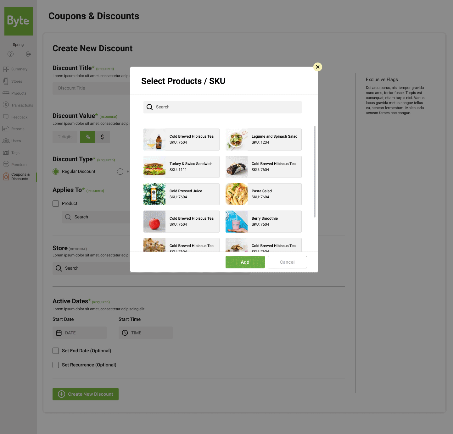
Search UX Pattern
Reflection & next steps
It was fascinating to work on Byte’s new discount experience. Since it’s a B2B product, I had to learn tons of new information very specific to the Byte environment. Collaborating closely with the product manager and the developer from Byte made the learning curve easier for me. With their institutional knowledge, I was able to make design decisions effective for their users and also feasible for the next phase of development. The Byte team was happy with the new design and thought that it would be a huge improvement in their clients’ user experience. I handed off the file and the Byte team will run the usability testing and validate if the design is actually intuitive and clear to use. I hope the new design makes it easier for admins to manage discounts and coupons.